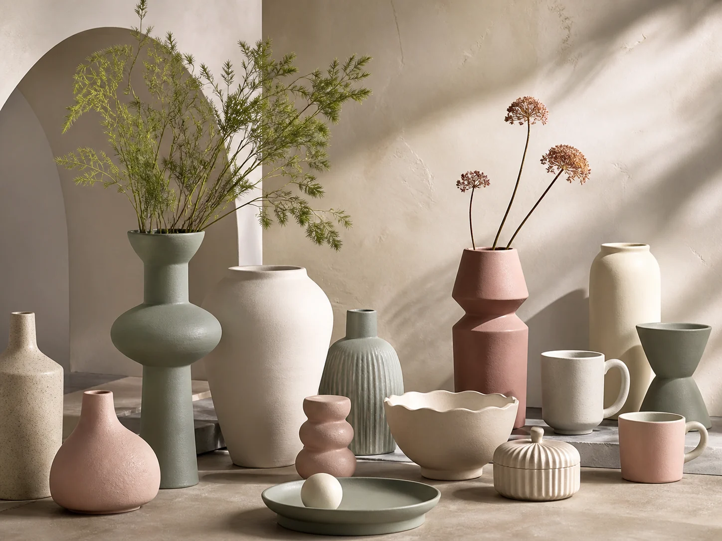
Morandi color palettes are built from softened, greyed tones rather than bright saturated colors. In homeware, this creates a calm visual language that feels modern without becoming trend-dependent. The result is especially useful for retailers and private-label brands that need products to coordinate across seasons, materials and living spaces.
Why muted palettes remain commercially relevant
Customers increasingly look for home décor that can move easily between rooms and coexist with furniture they already own. Sage green, warm ivory, oatmeal, dusty rose and mineral grey offer enough personality to feel designed, while remaining easy to mix. For buyers, this versatility can improve merchandising: a vase, mug, candle holder and serving bowl can be displayed as one family without every piece using exactly the same color.
Color becomes stronger through surface
In ceramics, color is never separate from glaze and clay body. A matte sage glaze can look architectural and quiet, while a reactive version of the same hue introduces movement and individuality. Speckled stoneware adds visual warmth; ribbed or hand-carved surfaces create shadow and depth. When developing a range, ask for physical glaze chips and production samples under both daylight and warm retail lighting. Screen colors alone cannot show glaze break, variation or texture accurately.
Building a balanced retail assortment
A strong Morandi collection usually combines three layers:
- A core neutral: ivory, sand or warm grey for high-volume, easy-to-place pieces.
- A signature color: muted sage or mineral green to create clear brand recognition.
- A soft accent: dusty rose, clay or pale blue used selectively for visual rhythm.
Keep the forms varied but connected. Rounded silhouettes, simple arches and softly fluted surfaces work particularly well because they reinforce the gentle character of the palette. Packaging photography and online product images should use consistent neutral backgrounds so subtle color differences remain visible.
Planning for reliable production
Muted glazes may still vary from firing to firing. Before confirming an order, define an approved color range rather than a single digital reference. Agree on tolerance samples, glaze application, firing method and inspection lighting. If several factories or materials are involved, use one master color standard across ceramic, candle and packaging components.
Buyer takeaway
Morandi colors work best when palette, texture and product shape are developed together. Start with a compact, coordinated color story and expand only after the core tones are approved in physical samples.